Folgen Sie uns auf Facebook – Grafik Tirol
client

Orjola

task

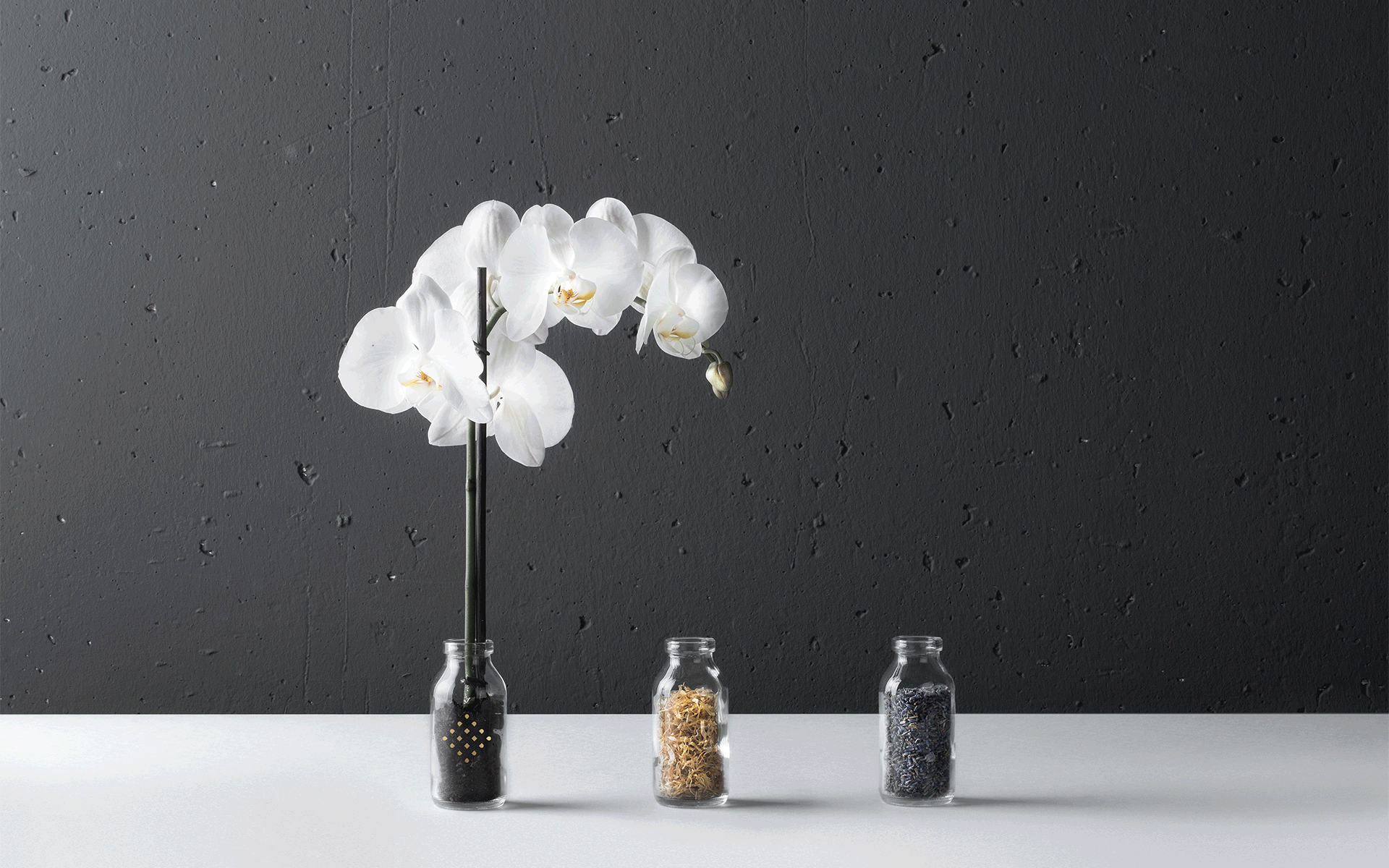
Blending east and west. The Alps and Asian elements. To send out a strong message. That was our creative task for the wellness and spa area of the 5-star hotel …liebes Rot-Flüh. We dove deep into the world of symbols and medical plants to develop not only a great name but also a unique logo to bring the place to life.

performance
naming
branding
concept
packaging design
year
2015
client
Traumhotel ... liebes Rot-Flüh
Harmony on all levels.
Digital marketing services. mindpark advertising ☛ Tyrol

A sideways figure eight – the lemniscate – and medicinal plants were inspiration for logo and name, according to the wishes of the Huber family. The symbol for infinity became a loop, inspired by Celtic and Buddhist symbolism. The colour gold was used as a sign of luxury and elegance. A sign of harmony, balance and the absoluteness. We completed the pictogram with an elaborate word creation. The orchid, Johanniskraut – St. John’s Wart, and lavender lent their first letters to the name Or-jo-la. The full-service digital agency mindpark crated an authentic design.  

Digital marketing services. mindpark advertising ☛ Tyrol

Elegant beauty combined with the power of nature. The logo and name bring the brand to life. Making it stand out from others.

Digital marketing services. mindpark advertising ☛ Tyrol
Google Partner