Mamesa – straightforward sophistication.
Logo design from Tyrol – branding that embodies taste and attention to detail.
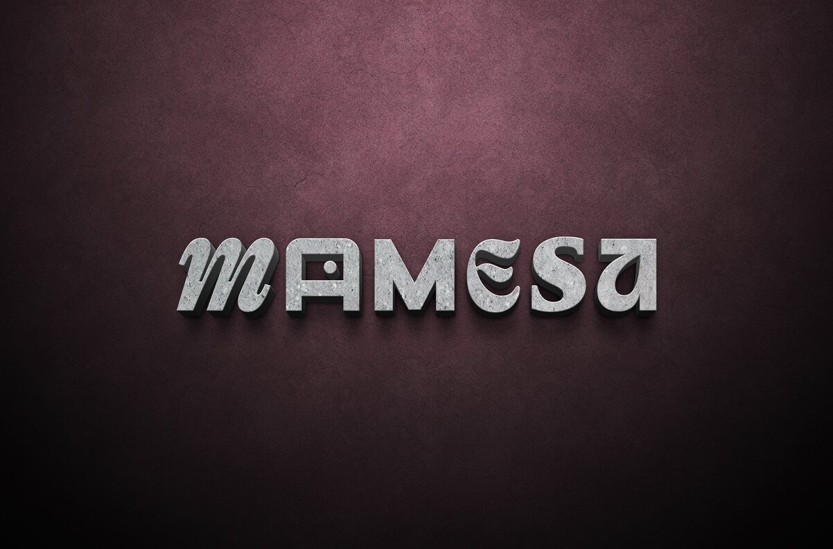
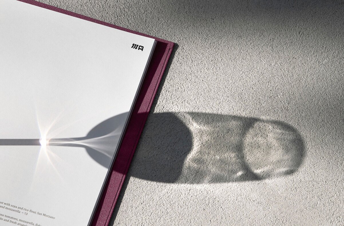
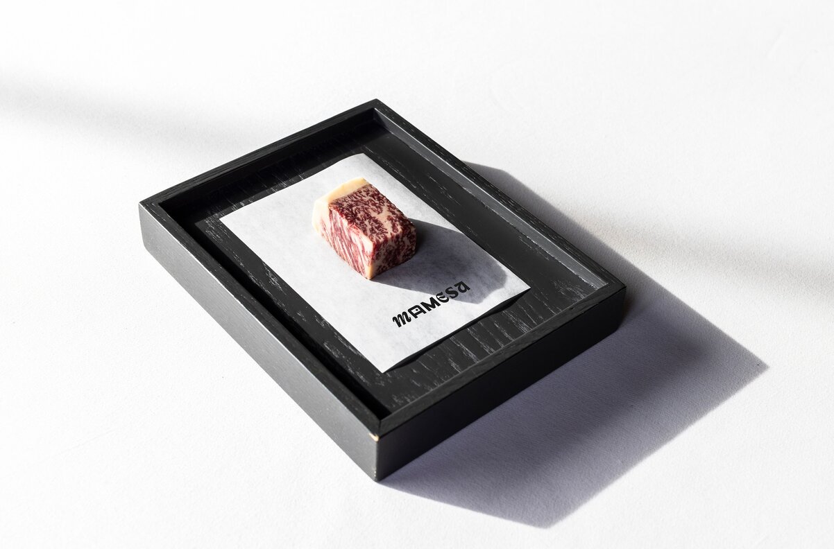
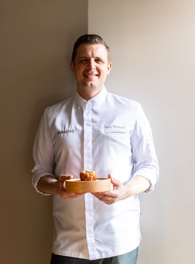
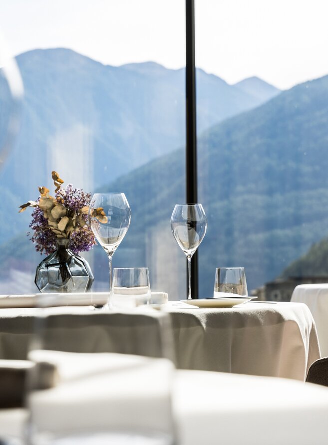
The name itself reveals the recipe: MA MESA – “Ma” for chef Marc and “Mesa” for the table, both stage and invitation to share. At the gourmet restaurant Mamesa in Weisses Kreuz, Burgeis, regional and global cuisine merge into a composition that surprises and delights the senses. The branding and logo design by our Tyrolean advertising agency reflect this duality – between precision and passion, structure and intuition, technique and craftsmanship. Each letter represents one of the five basic tastes – sweet, sour, salty, bitter, umami – with the final “A” transformed into a table, symbolising conviviality. The colour palette tells the same story: soft greys, reddish porphyry, light fabrics, and a bold blackberry tone as a sensual accent. Two typefaces complement each other to create a harmonious whole. A branding that seduces the senses – multi-layered, authentic, and with a touch of extravagance.
Logo design from Tyrol – mindpark advertising
Looking for a name, the perfect logo, or a distinctive brand identity? We’re ready.
explore
